CATEGORY
UX + UI Design
Website Design
TOOLS USED
Adobe Illustrator
Adobe Photoshop
Figma
HTML + CSS
Balsamiq
PROBLEM STATEMENT
Existing and prospective clients lack incentive to use the website due to poor usability and functionality, potentially hindering business opportunities.
PROJECT GOAL
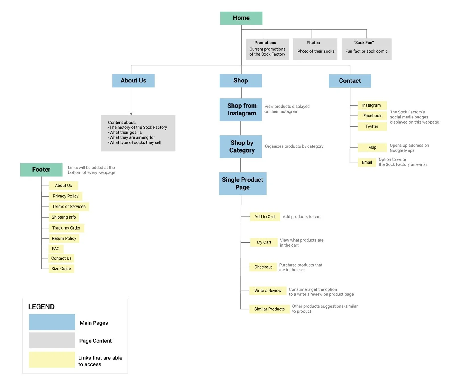
The overarching goal of the project is to achieve a unification of the quality of the products and online identity. Moreover, we aim to generate more clientele for the business through a website redesign, requiring a rearrangement of the information architecture, an updated style, additional website features, and the incorporation of an intuitive user flow.
RESEARCH
User Profile
The website is specifically for those shopping for socks while building loyal clientele with the company.
Demographics
It was inferred from online reviews that on average, the company’s customers are young adults. We concluded from said reviews that most visitors of the website were locals of the Kitchener/Waterloo area.
User Goals
The end goal of the website is the online shopping by encouraging customers to view and buy products.
User Needs
Users require general information about the shop, along with their contact information and location. They also need access to shop the socks, allowing them to gauge their interest with the wacky element of socks and variety of colour and patterns. Additionally, users should have access to unbiased reviews
WEBSITE DESIGN CRITIQUE
Aesthetics
•Poor use of space
•Landing page content contains too much white space
•Poor legibility in primary font
•Poor line spacing, font pairing
•Lack of typographical hierarchy
•Unbalanced colour palette
•Colour palette is limited and lacks congruency/chromatic harmony
•Lack of iconography
•Poor iconic guidance e.g.: home, etc.
•Redundancy
User Interaction & Experience
•Convoluted navigation system
•Information inefficiency
•Unintuitive user flow
•Inefficient browsing method gallery
•Slideshow for deals is a pain point for the user
•Poor placement/spacing
Scripting/Coding
•Non-responsive design
•No footer/menu bar (could gain from sitemap, contact info, etc)
Brand Identity & Presentation
•Personable feel (fun, bright, events such as free cake days)
KEY TAKEAWAYS
Improved Functionality
The inclusion of a preliminary shop button function within the landing page is beneficial and eliminated certain pain points associated with the typical user journey.
Improved User Experience
Those who interacted with the prototype agreed that the navigation was streamlined, and the sub-page interactions were user-friendly, proving our solution to be an improvement from the initial website. In addition, the style is very much reflected the atmosphere of the company.
DESIGN RATIONALE
Design
In an attempt to combat the redundant design of the original website, extensive consideration was given to the spacing of each element. We made efforts by adding a variety of call to action buttons on-screen, introducing typographical hierarchy to the site, but keeping the fun element of the socks.
Structure
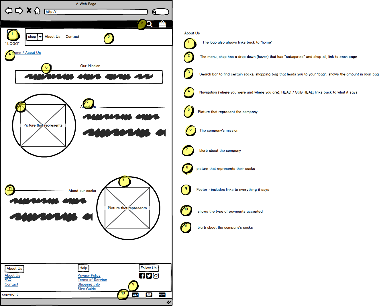
Our new design features company history, customer reviews, the shop’s location. Additionally, getting in contact with the company is now made easy as possible.
Usability
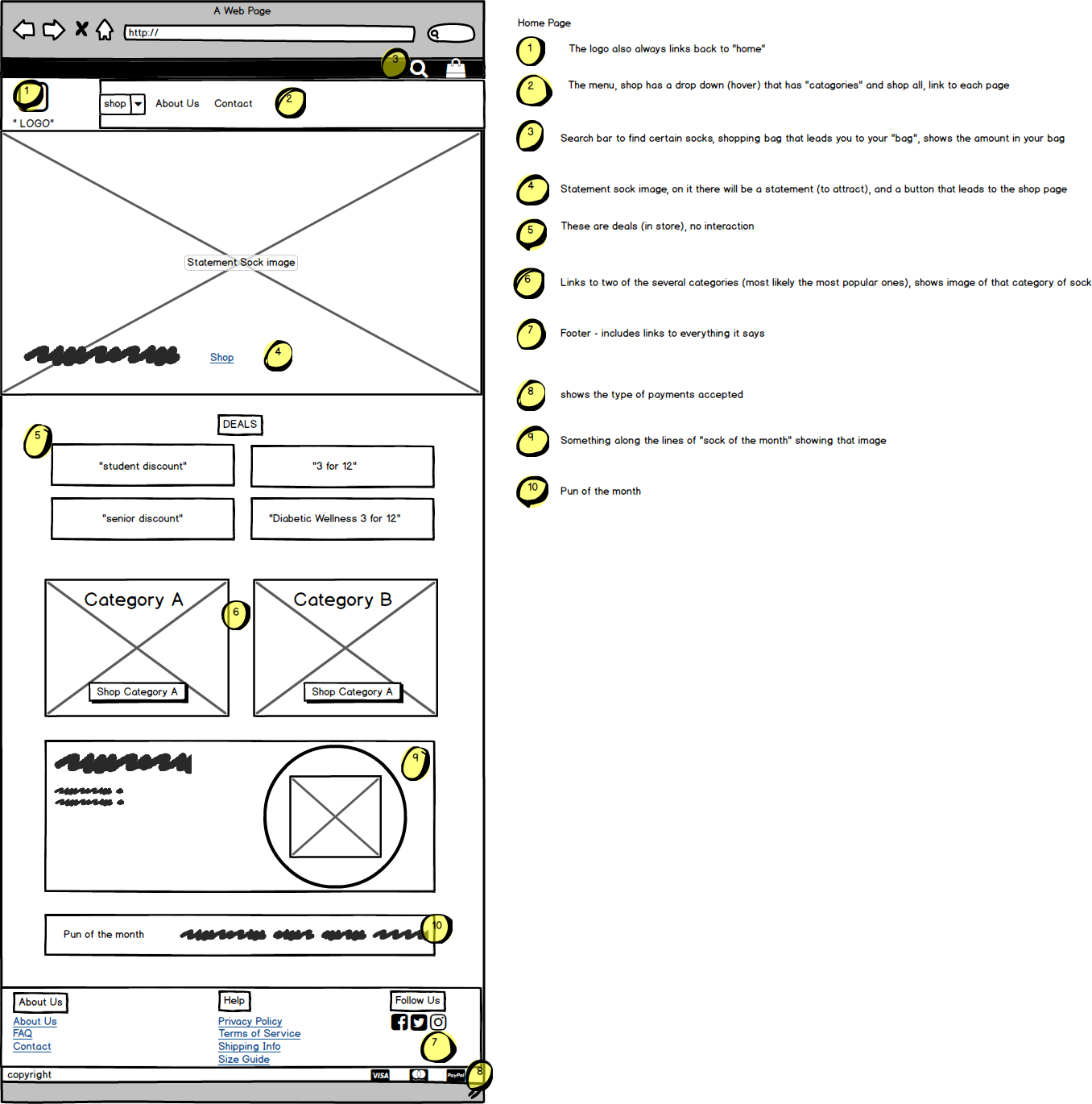
The composition of the landing page invites users to explore the entire website feature “Fan Favourite of the Month”, sock puns, and a direct access to the shop gallery. Rather than a simple image carousel, it now steers the users to their desired goals.
ITERATIVE DESIGN PROCESS
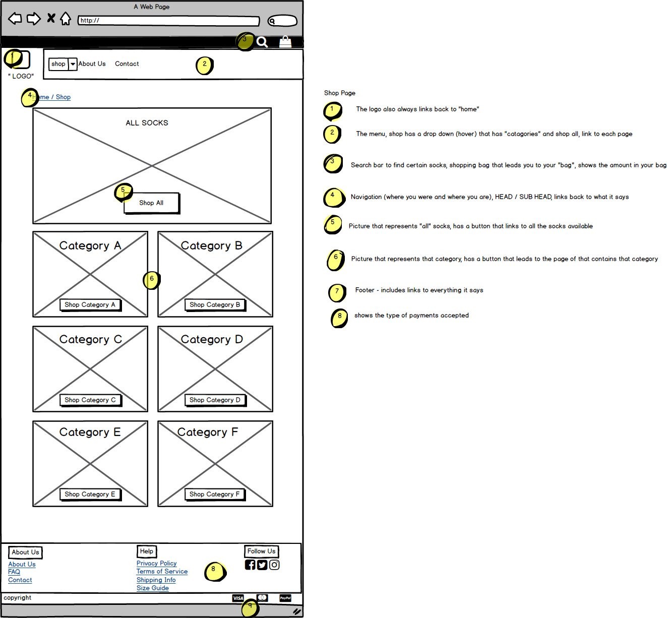
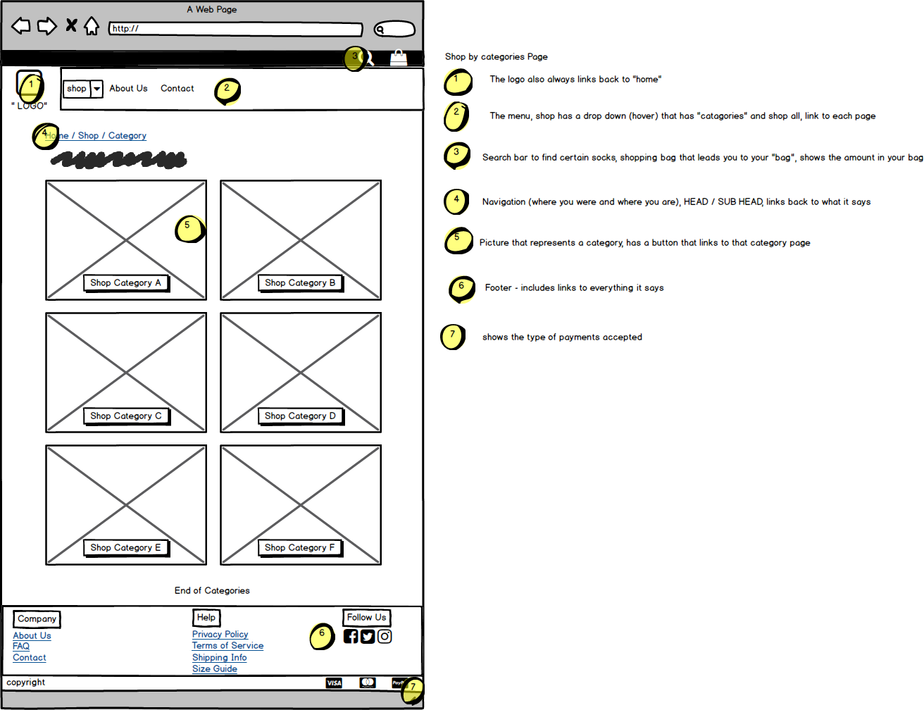
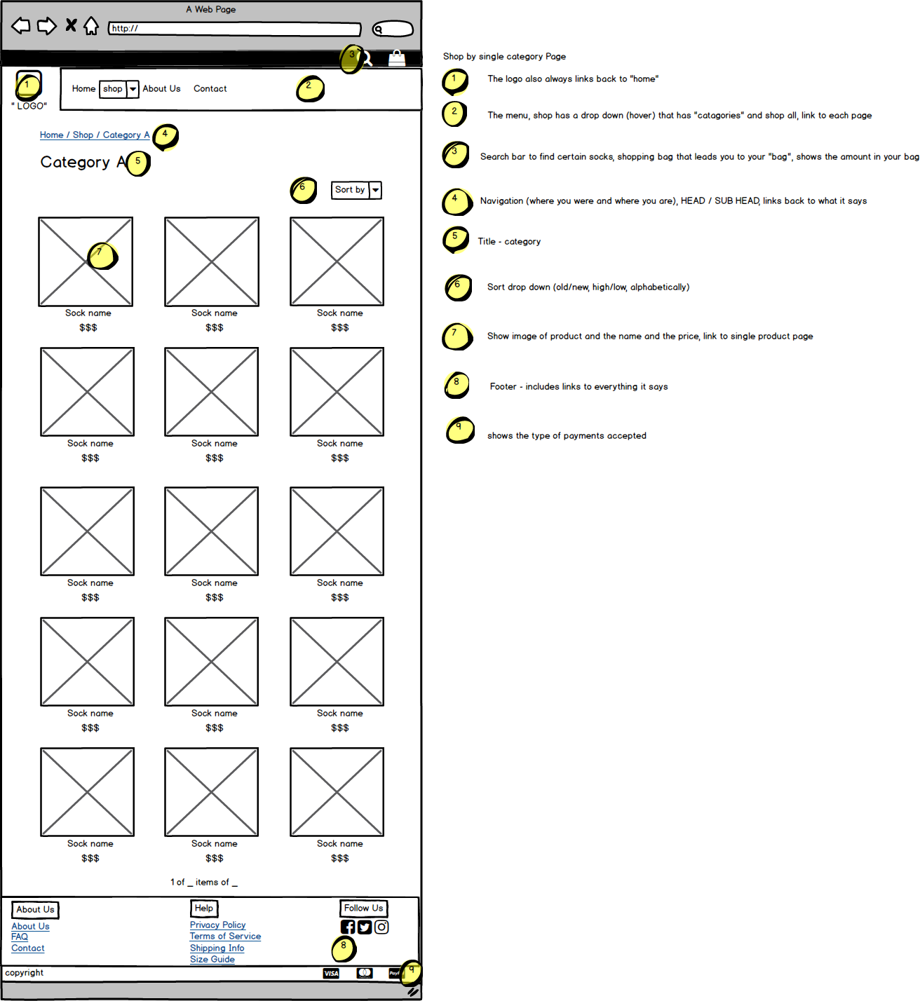
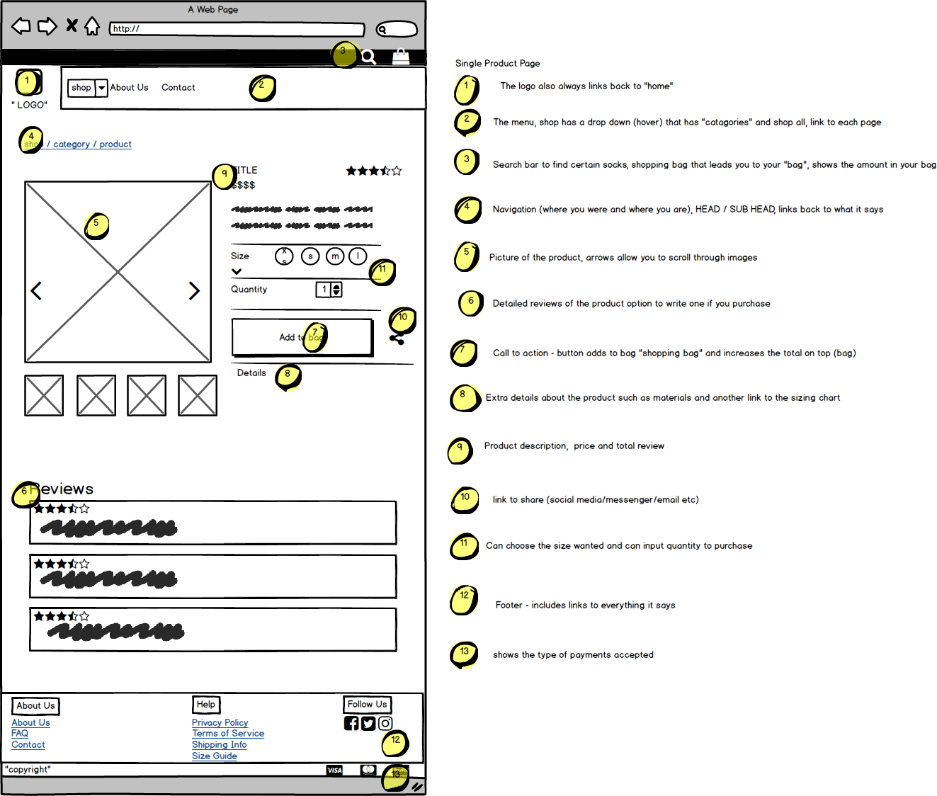
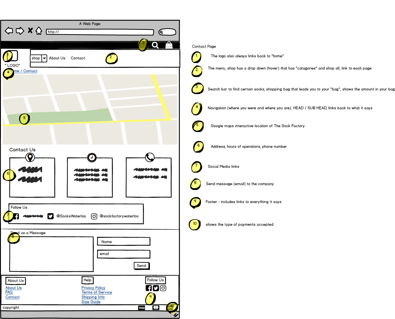
Wireframing
User Flow/ Sitemap